The Collection / Coordination
CoordinationStreamlining Data Review
Drop in your IB results files and the charts build themselves — then a three-phase protocol turns the numbers into one change each department will actually make next year.
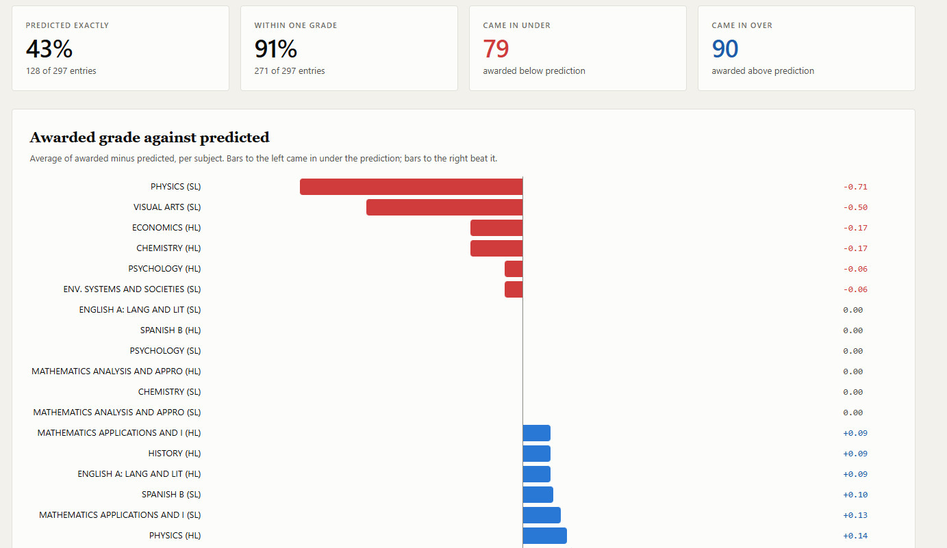
Five views, shown with invented demo data
The problem
Results arrive in July, and every coordinator knows what comes next: hours of screenshots from the IB's own reports, or an afternoon rebuilding the same charts in Excel as last year. Then a staff meeting where a slide of numbers goes up, the room looks at it, and the conversation goes one of two ways — celebration or blame. Neither changes anything in September.
What it does
You download the candidate, subject and component data from IBIS, save each as CSV, and drop them onto the page. It takes one, two or three files, and each view switches on as the data behind it arrives. File names and column order don't matter — only the headings do, and they match the IB's own.
From those files it builds the views a data review actually needs:
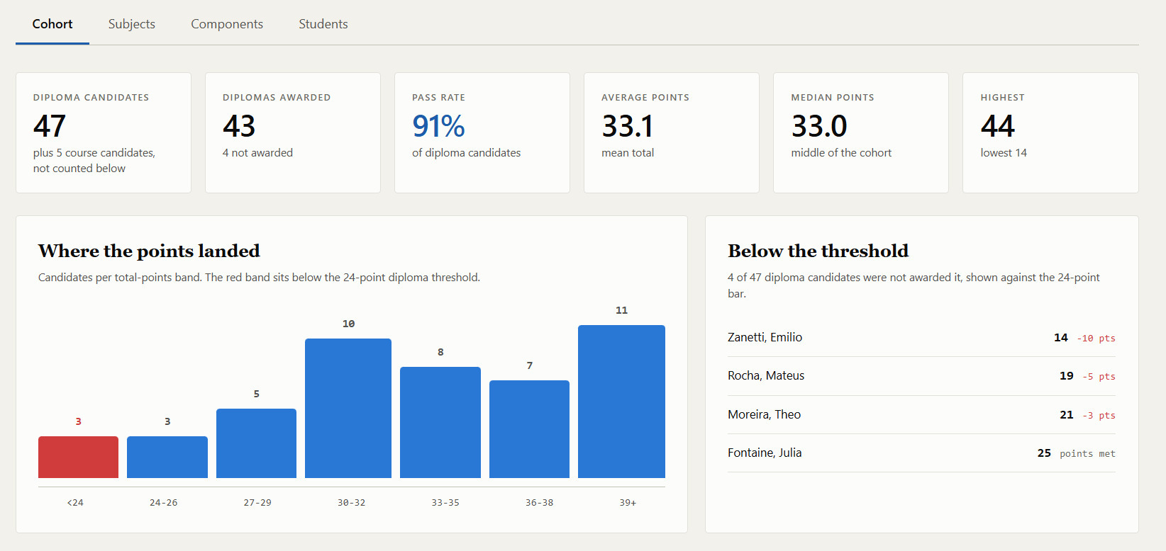
- The cohort headlines — diploma candidates, diplomas awarded, pass rate, and average, median and highest points
- Where the points landed — the cohort by total points, with the band below the diploma threshold marked
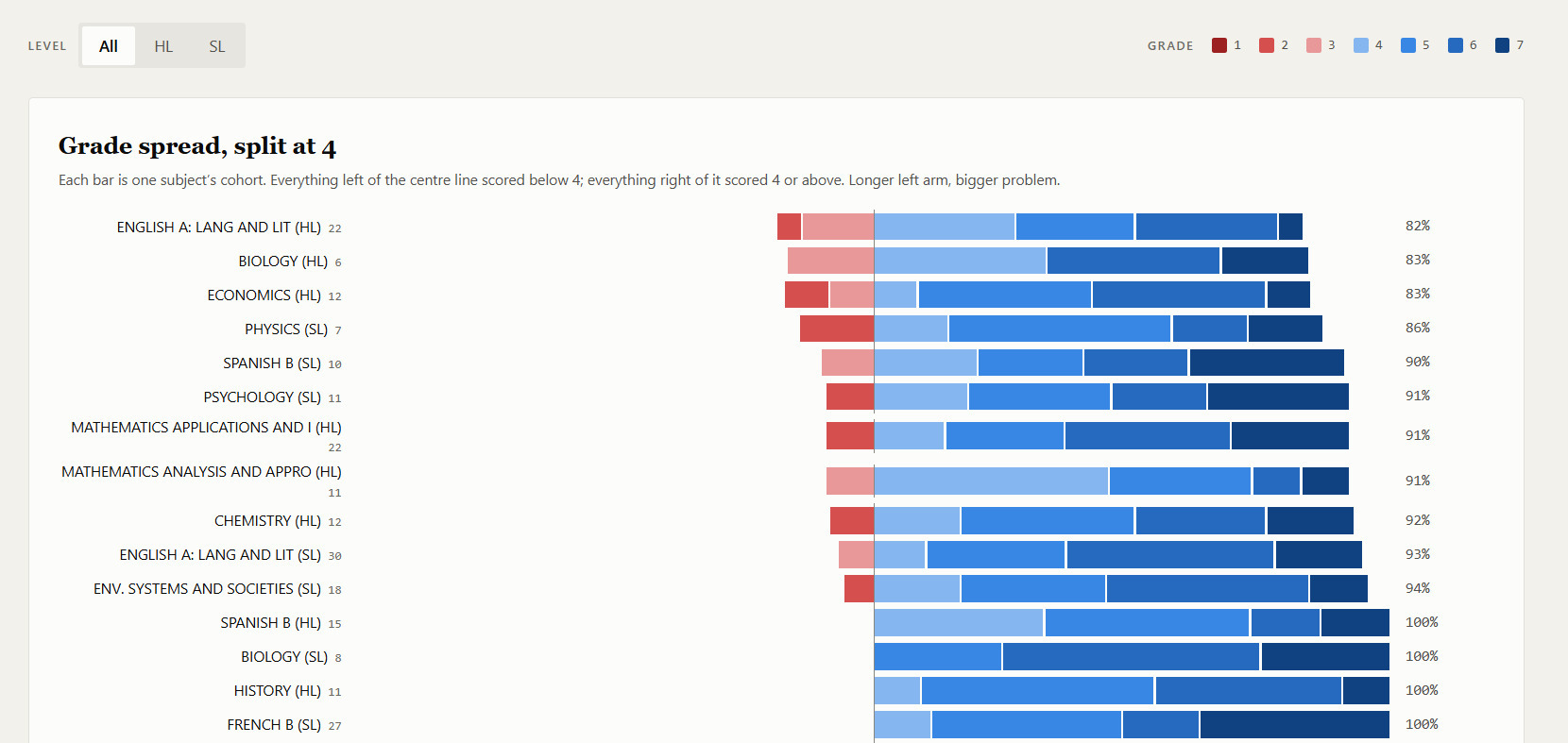
- Grade spread — every subject on one chart, split at a 4, so the subjects with students below the line are visible at a glance
- Awarded against predicted — how many students came in exactly on their prediction, within one grade, under or over, subject by subject
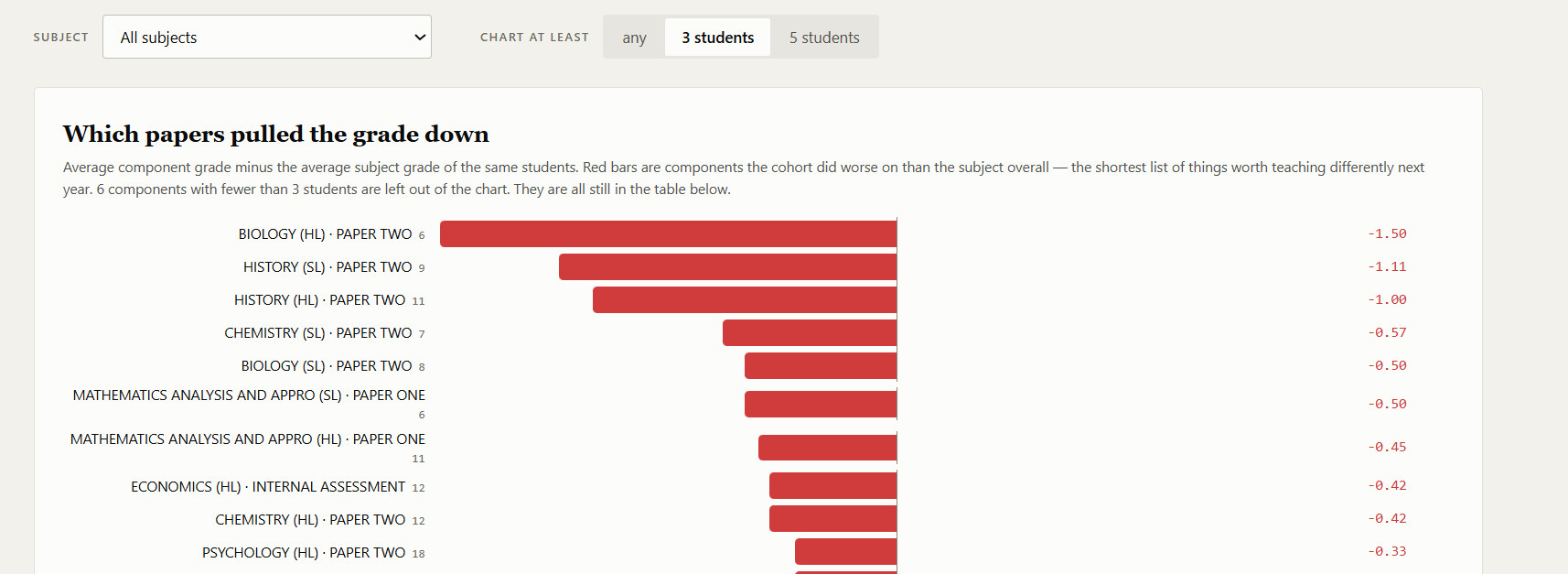
- Which papers pulled the grade down — the gap between each component and the subject grade, so a department can see whether the problem was Paper 1, the IA or the oral
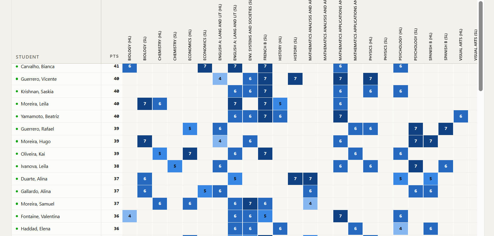
- Every student, every subject — the full grid, with total points and EE and TOK alongside
Everything left of the center line scored below 4. Longer left arm, bigger problem.
One small switch deserves a mention. The component chart can be set to show only groups of at least three or five students. A subject with two candidates will always produce a dramatic gap, and a dramatic gap from two students is noise wearing the costume of a finding. Hiding them by default keeps a department from redesigning a course around one bad afternoon.
Your students' data never leaves the room
Results files carry names, grades and predictions — exactly the data a school should be most careful with. So the tool has no server and makes no network requests of any kind. The files are read inside your browser and go nowhere, which means you can use an unanonymized export safely. Use it straight from this site, or download the file and run it offline if your school would rather see it disconnected.
When you want to share results with staff, Save with data writes a copy of the page with the charts already in it — a single file anyone can open, no setup required. That copy carries the results inside it, and the tool says so when it saves: send it the way your school sends student data, not by a public link. There's also a print view for the meeting itself.
Then the protocol
Charts don't change teaching; conversations do. The worksheet runs a data review in three phases, and the order is the point.
Observe. Facts only — at least three observations per teacher that a stranger could verify by looking at the same cells. Our average grade was 0.6 below our average predicted grade is an observation. The kids didn't revise is not, yet.
Interpret. For each important observation, at least two competing explanations before anyone decides which is more likely, sorted into four buckets: curriculum, instruction, assessment familiarity, and cohort and context.
Only the first three are fully within our control, so interpretations should not stop at the fourth.
That single line is what keeps a data review from ending with it was a weak year group. Cohort can be part of the explanation. It can't be the end of it.
Commit. One instructional change specific enough to start in the first unit of the next year, a monitoring question, and the interim evidence the team will collect — so that the next data review isn't the first time anyone finds out whether it worked.
Each phase has its sentence stems, and a one-page notetaker sheet captures a team's observations, best-supported interpretation, strongest and weakest components, commitment, monitoring question, and the support they need.
What's in it
- The results review tool — a single HTML file that opens in any modern browser, online or off
- The data review protocol — the three phases with sentence stems, plus the team notetaker sheet, as an editable document and a PDF
Who it's for
DP coordinators preparing August data review, and heads of department who want to look at their own subject's results properly before the meeting rather than during it.
It's the other end of the cycle from Two Years on One Screen, which plans the internal deadlines for a cohort. That one looks forward; this one looks back at how it went.
The small-sample switch is the same problem Kahneman describes in Four Experts, One Algorithm — small groups produce extreme results — turning up where it matters most, in your own department's numbers.
Take it
Free Tool and protocol · no signup · nothing leaves your browserOpen the tool here and drop your files in, or save it and run it offline. Not affiliated with or endorsed by the International Baccalaureate Organization.